Harmony in Floral Composition: The Balancing Act
A bride once asked for three more peonies in a centerpiece that was already finished. The arrangement had taken forty minutes to build — eighteen stems, a low compote, the stems crossing at precise angles so the mass leaned left while a run of trailing clematis pulled the eye right. It was resolved. Three more peonies did not make it fuller. They made it wrong — the left side suddenly outweighed everything else in the room, and the composition that had been breathing now sat heavy on the table. This is the part of the work that is hardest to explain to a client standing at the bench: balance is not generosity, and more flowers are not more beautiful. Harmony in floral composition is a calculation, run quietly, stem by stem.
30 min read · Les Fleur Company
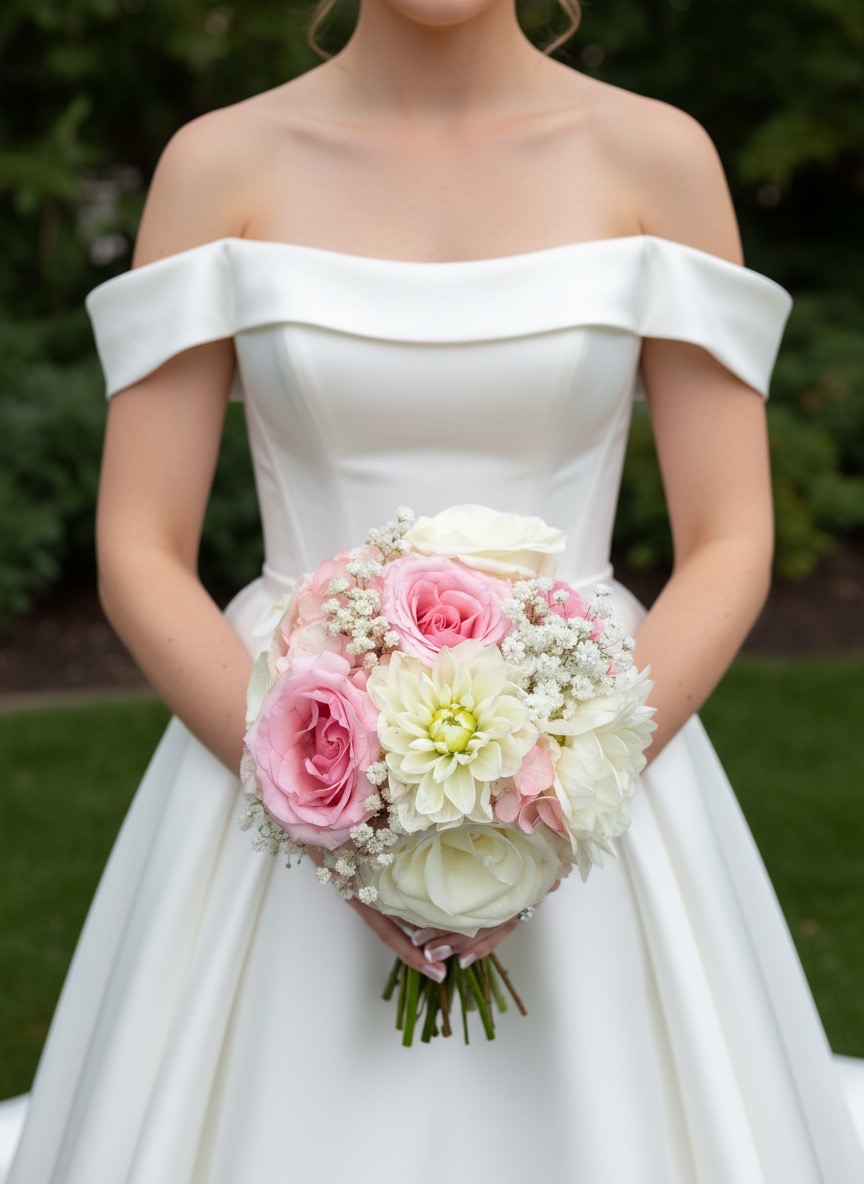
The Weight of One Too Many Stems
Every stem added to an arrangement changes its center of gravity, whether or not it changes its height or color. A single garden rose, fully open, carries more visual weight than three stems of waxflower combined — not because it is larger in diameter, necessarily, but because the eye processes a solid mass faster than a scattered one. Designers who have not internalized this will keep adding stems to a composition that feels unfinished, when the actual problem is that two elements are fighting for the same visual territory.
The instinct to add is understandable. A gap in an arrangement looks, at first glance, like an absence. But a gap is frequently doing structural work — holding the eye, giving the denser areas somewhere to resolve. Removing a stem, rather than adding one, is the correction nine times out of ten. This is not an aesthetic preference so much as a mechanical one: weight has to go somewhere, and the composition either accounts for it or collapses under it.
Clients rarely ask for less. The work, then, is explaining why less reads as more considered — and proving it, arrangement after arrangement, until the restraint itself becomes the signature.
What Harmony Actually Means at the Bench
Harmony is not symmetry. Symmetry is the easier, lesser cousin — mirror the left side on the right, and the composition will look tidy, but tidy is not the same as composed. Harmony is the condition in which every element — mass, color, line, texture, and the air between them — carries a weight that offsets every other element, so the whole settles rather than searches. An arrangement can be wildly asymmetrical and still be perfectly balanced, the way a cantilevered structure holds its load without a mirror image on the other side.
At Les Fleur, this gets taught the same way to every apprentice: hold the arrangement at arm's length, close one eye, and ask where the weight sits. If the answer comes immediately — if one side or one bloom announces itself before the whole does — the piece is not finished. The five essential elements that govern a timeless floral composition all resolve, eventually, into this one test.
This is why harmony takes longer to build than abundance. Abundance is additive and finishes when the container is full. Harmony finishes when the eye stops moving.
Visual Weight, Not Symmetry
Visual weight is governed by four variables that designers learn to read almost instinctively after a few thousand arrangements: size, density, color saturation, and distance from the central axis. A large bloom close to center carries less apparent weight than a smaller bloom placed near the edge, because the edge amplifies whatever sits there — the same principle that makes a seesaw tip with a child at the far end rather than the middle.
Consider a compote arrangement built around five garden roses in Mondial, a deep red that reads almost black in low light. Positioned in a tight cluster at center, those five roses feel grounded, almost sculptural. Spread the same five roses toward the rim, and the arrangement suddenly feels unstable — too much weight too far from the axis, nothing to hold it down. The flowers have not changed. Their placement has.
The correction for an unbalanced composition is almost never "add here." It is "move this three inches," or "turn this stem fifteen degrees," or simply "take this one out." A trained eye diagnoses imbalance the way a carpenter diagnoses a door that will not close — not by guessing, but by checking the frame.
Color as Counterweight
Color carries weight independent of size, and this is the variable clients most often misjudge. A single stem of deep burgundy lisianthus can balance an entire quadrant of pale, dusty material — blush garden roses, dusty miller, a trailing eucalyptus — because saturation reads heavier than volume. This is why a seemingly small addition of dark color can rescue an arrangement that otherwise feels washed out and formless, and why a single wrong-colored stem can tip an otherwise careful palette.
Warm and cool tones behave the same way structurally. A cluster of warm apricot ranunculus on one side of an arrangement needs a cooler counterweight on the other — lavender, a cast of silvery dusty miller, even the cool green of unopened hydrangea — or the composition will feel like it is leaning, visually, toward the warmth. This is the same logic explored in color theory in wedding floral composition: palettes are not chosen for beauty alone, but for how their temperatures distribute weight across a form.
A monochrome arrangement, built entirely in cream and ivory — Vendela roses, white lisianthus, a quiet run of jasmine vine — solves the color-weight problem differently. Here, weight is carried entirely by density and form, since saturation is held constant. It is, in some ways, the hardest palette to balance well, because there is no color to hide behind.
Scale and the Space Around It
Scale decisions happen before a single stem is cut. A twenty-four-inch reception centerpiece on a sixty-inch round table needs a different stem length, bloom size, and container height than the same flowers built for a twelve-inch bud vase down the center of a king's table at a rehearsal dinner. Scale that is correct for one setting reads as either cramped or lost in another, regardless of how well the internal balance is resolved.
The container itself is part of the weight calculation, not a neutral vessel beneath it. A heavy ceramic urn anchors a composition and can support taller, more dramatic lines above it. A slim glass cylinder, by contrast, has almost no visual mass of its own, which means the stems have to do all of the grounding work — usually through a denser base of foliage like dusty miller or eucalyptus that holds the eye at the table's surface before it travels upward.
Negative space is a scale decision as much as a compositional one. A six-inch gap between two blooms reads as intentional in a twenty-inch arrangement and as an error in a ten-inch one. Designers scale the pauses along with the flowers — which is part of why a composition that works beautifully at one size can fail entirely when simply enlarged without rethinking the proportions underneath it, a point addressed at length in crafting a masterful floral composition.
Texture, the Quiet Variable
Texture is the variable clients notice last and designers weigh first. A composition built entirely from smooth-petaled blooms — peony, ranunculus, garden rose — feels soft but can flatten under certain light, with nothing to catch a shadow or break up the surface. Texture is what gives an arrangement depth when viewed from across a room rather than across a table.
Fine, airy material — lisianthus foliage, astrantia, a loose stem of clematis vine — carries almost no visual weight on its own but changes how the eye reads the denser blooms around it. A single peony surrounded by smooth foliage looks heavier than the same peony surrounded by something textural and broken up, like dusty miller or scabiosa pods. The peony has not changed size. The context around it has changed how much weight it appears to carry.
This is why experienced designers often correct an unbalanced arrangement not by touching the dominant bloom, but by adjusting what surrounds it. Texture is the lever that moves perceived weight without moving a single primary stem — the quietest tool in the kit, and often the most effective.
A Reception Table in Lake Tahoe: The Numbers
A recent reception at a Lake Tahoe wedding called for fourteen centerpieces across a long farm table, each built to the same specification but none identical — a deliberate choice, since fourteen matching arrangements in a row tend to read as decor rather than craft. Each centerpiece used between twenty-two and twenty-six stems: six to eight garden roses, four stems of lisianthus, three of trailing clematis, and the balance in eucalyptus and dusty miller, built into a nine-inch compote.
The budget for the table ran roughly $4,200, or about $300 per centerpiece — a number worth stating plainly, because clients often assume more stems equal more cost, when in practice the labor of balancing twenty-two stems correctly costs more than the thirty-fifth stem would. Three of the fourteen arrangements were rebuilt once on site, not because they were wrong by count, but because the venue's low evening light shifted how the burgundy tones read against the wood table, requiring a texture adjustment — more dusty miller, less bare stem — to restore the weight that candlelight had quietly removed.
This is the detail most proposals omit: balance is tested against the room the arrangement will actually occupy, not the workbench it was built on. A composition that is correct under studio light can tip under candlelight, and the adjustment is made on site, not after the fact.
The Eleventh Stem
There is a point in nearly every arrangement — ten stems in, sometimes eleven, sometimes seven — where the composition is finished and does not know it yet. The designer's hand is still moving, the vessel still has room, and the instinct says to keep going. The eleventh stem is the one that ruins it: not because it is a bad stem, but because the balance was already resolved before it arrived.
Recognizing that point takes repetition. Newer designers at the bench tend to keep building past it, out of a reasonable fear that the arrangement looks sparse when it is, in fact, complete. The test is the same one used earlier — step back, check where the eye settles — but applied earlier and more often, before the extra stem goes in rather than after it has to come back out.
This is also where client expectations have to be managed directly and without apology. A considered client paying for craft is not paying by the stem; they are paying for the discipline to stop. Explaining that plainly, before the arrangement is built rather than after, avoids the awkward conversation about why a $400 arrangement uses fewer flowers than a $250 one from elsewhere — it very often should.
Where Balance Breaks Down
Three mistakes account for most unbalanced compositions seen in review. The first is treating color and size as the only variables, ignoring texture and spatial distance entirely — an arrangement can be correct by every measure of hue and have no finer texture to carry it, which flattens the whole piece under direct light. The second is building for the workbench angle rather than the room's actual vantage point: a centerpiece viewed from directly above, as most designers build it, reads differently once guests are seated and viewing it at eye level across a table.
The third, and most common, is correcting an imbalance by addition rather than subtraction. A designer notices one side feels heavy and, instead of removing material from that side or adding counterweight on the other, adds more to the light side to "catch up" — which usually just makes the whole arrangement bigger and no more balanced than before. The fix almost always lives in what is already there, repositioned, rather than in what gets added.
A fourth, subtler failure: ignoring how a composition reads from a walking sightline rather than a seated one. Processional arrangements, aisle markers, and entry pieces are seen in motion, which changes how quickly the eye needs to resolve weight — a lesson built into every approach to bridging tradition and modern composition across a wedding's full floral program.
A Working Checklist Before the Day
For clients reviewing proposals or sign-off photos before an event, a short checklist translates the designer's internal process into something that can be verified at a glance, without needing the vocabulary of the trade:
That last question is the most honest test available. If a stem can be removed without the arrangement changing, it was never doing structural work, and its absence should be considered seriously rather than treated as a loss.
Balance, in the end, is not a style choice layered onto an arrangement after the fact. It is the condition that determines whether flowers read as composed or merely accumulated. The work is quiet, and when it is done correctly, no one at the table mentions it at all — which is, itself, the measure of having gotten it right.
Considered
What does harmony mean in floral composition?
Harmony means every element in an arrangement — mass, color, texture, and the air around the stems — carries a weight that balances against every other element, so the eye settles rather than searches. It is not symmetry or matching; it is equilibrium, often achieved with asymmetrical placement.
How do florists balance an arrangement without making it symmetrical?
They weigh visual mass rather than physical count. A large peony head positioned off-center can be balanced by a cluster of smaller lisianthus and a stretch of open space on the opposite side, so the composition feels settled without mirroring itself.
Why does negative space matter in a floral arrangement?
Negative space gives the eye a place to rest and lets individual stems register as distinct forms rather than a blur of color. Without it, even a well-chosen palette reads as crowded, because density is mistaken for abundance.
How many stems should a centerpiece have?
There is no fixed number — it depends on container, scale, and venue lighting — but most considered centerpieces hold their shape better with fewer, larger-impact stems than with many small ones. Adding stems past the point of visual completion usually weakens the arrangement rather than strengthening it.
Can color alone create balance in a floral design?
Yes. A single saturated bloom, such as a deep burgundy garden rose, can offset a much larger mass of pale, muted material because color carries its own visual weight independent of size. Designers use this to balance compositions that would otherwise feel top-heavy or washed out.
What is the most common mistake in trying to achieve balance?
Adding more material to fix an imbalance, when the correction is almost always subtractive. Most unbalanced arrangements are solved by removing a stem, widening a gap, or lowering one element — not by introducing new flowers to compensate.