Creating a Timeless Floral Palette for Your Luxury Wedding
Three weeks before a wedding at a stone chapel outside Charlottesville, the bride sat across a farm table covered in ribbon swatches and photographs of last season's work. She wanted to know why her florist kept steering every option back toward four colors — ivory, blush, sage, and a single deep burgundy for the arch. The answer had nothing to do with taste and everything to do with a timeless floral palette: the fewer colors a design carries, the longer it holds up in a room, in photographs, and in memory.
32 min read · Les Fleur Company
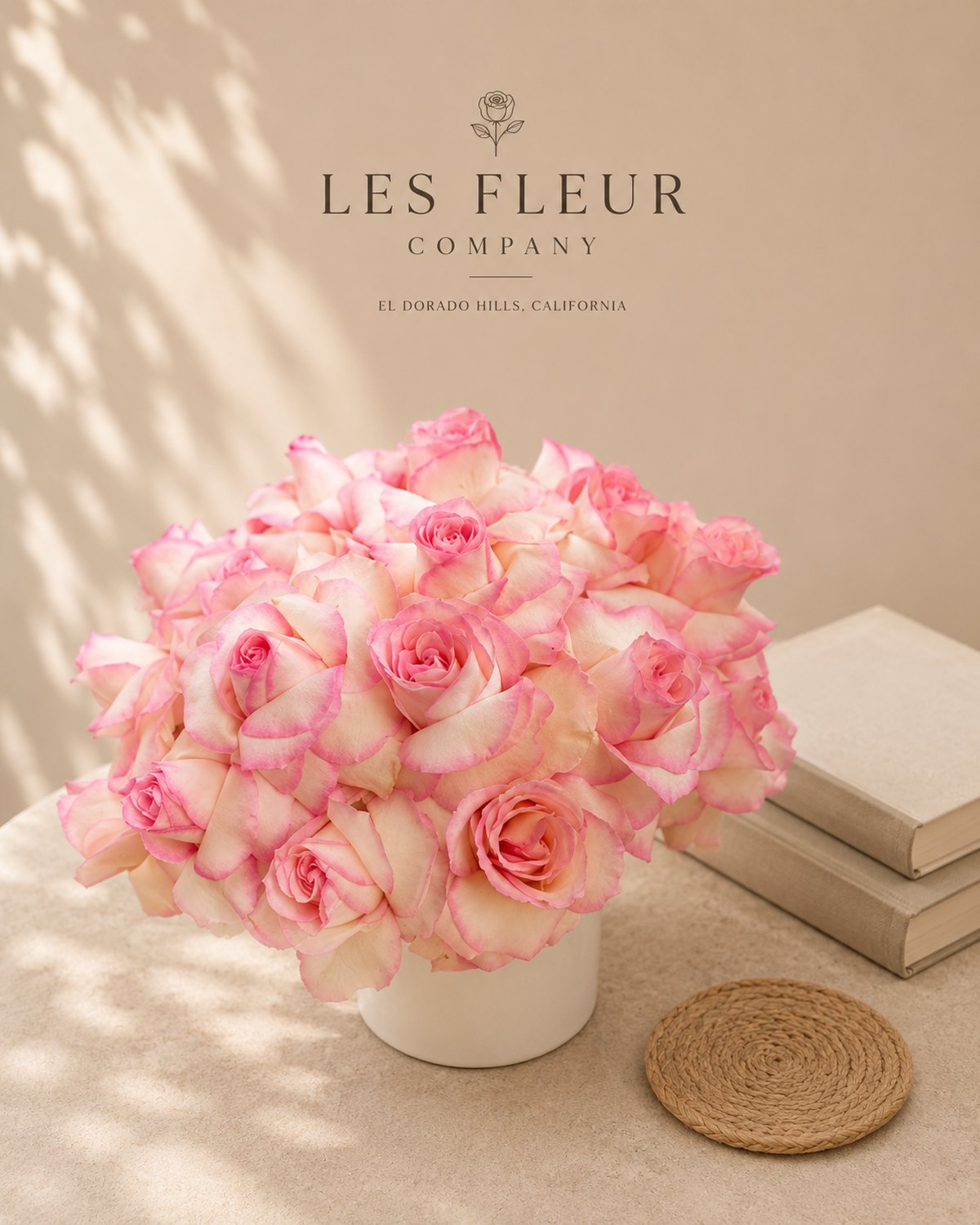
The Room Decides Before the Flowers Do
Three weeks before a wedding at a stone chapel outside Charlottesville, the bride sat across a farm table covered in ribbon swatches and photographs of last season's work. She wanted to know why her florist kept steering every option back toward four colors — ivory, blush, sage, and a single deep burgundy for the arch. The answer had nothing to do with taste and everything to do with a timeless floral palette: the fewer colors a design carries, the longer it holds up in a room, in photographs, and in memory.
Palette work happens at the consultation table, not at the flower market. By the time stems arrive at the studio, the decisions that matter — which three or four colors will run through the ceremony, the reception, and every arrangement in between — are already made. A florist who waits until the week of the wedding to settle on color is not composing an event. She is assembling one.
This is the case for slowing down. A considered palette accounts for the stone of the venue, the hour of the ceremony, the season the flowers are grown in, and the years the photographs will be looked at. It resists the urge to chase what is trending on a moodboard this month, because a wedding photographed in 2026 still needs to look composed in 2036. The work is not decoration. It is architecture, built in color instead of stone, and it starts long before the first bucket of roses is unwrapped.
Why Restraint Outlasts Trend
Every florist has watched a bride ask for 'just a few more colors' — dusty blue added to the blush and sage, then a champagne accent, then a pop of coral because her sister liked it. Each addition feels small. Together, they produce an arrangement that reads as noise rather than composition. The eleventh stem is the one that ruins it — not because it is wrong on its own, but because it competes with the ten that came before.
A palette built for permanence works from restraint, not abundance. Three to four working colors, arranged in a clear hierarchy, will outlast a six-color palette assembled for novelty. The discipline is not about withholding beauty. It is about giving each color room to do its work: an anchor tone that carries weight, a neutral that lets the eye rest, and one accent that earns its place by contrast rather than decoration.
Trend-driven palettes date quickly because they borrow from a specific cultural moment — a particular shade of terracotta, a very-online sage green, a color pulled from a single influential wedding two seasons ago. A timeless floral palette instead draws from things that do not go out of fashion: garden variety, natural light, the stone or wood of the room itself. Vendela roses, ivory lisianthus, and eucalyptus read the same way in a photograph today as they will in a decade, because they were never chasing a trend to begin with. Restraint is not the absence of a decision. It is the most deliberate one a florist makes.
Reading the Venue: Light, Stone, and Season
No palette exists apart from the room it will sit in. A florist who chooses colors before walking the venue is guessing. The work begins with three questions: what does the light do at the hour of the ceremony, what materials surround the arrangements, and what does the calendar actually grow.
Light changes everything. A five o'clock ceremony under western light will warm every white toward gold — a palette built for that hour should lean into cream and apricot rather than stark white, which can look flat or even blue-tinted as the sun drops. A ten o'clock morning ceremony under even, diffused light can carry a cooler palette of ivory and sage without losing warmth.
Stone and wood set boundaries too. A gray stone chapel absorbs color; a wedding there can carry more saturation — a deep burgundy, a plum dahlia — without overwhelming the room. A whitewashed barn or a light-filled greenhouse reflects color back, so the same burgundy can read as heavier than intended. Venues with heavy existing pattern — floral wallpaper, patterned tile — call for the simplest palette a florist can defend, often just two tones.
Season narrows the list further, and honestly. Peony season runs roughly eight weeks, April into June depending on region, according to the Royal Horticultural Society's seasonal guides; a couple set on peony pink for a September wedding is not choosing a color, they are choosing a substitute. The better answer is dahlia, garden rose, or ranunculus in a comparable tone, sourced when it is actually in season — a palette that respects the calendar reads as more considered, not less.
The Three-Color Rule: Anchor, Neutral, Accent
A palette that holds together over the course of a wedding day — ceremony, cocktail hour, reception, the bouquet carried through all three — needs a structure, not just a list of favorite colors. The studio works from a simple ratio, close to 60-30-10: roughly sixty percent neutral, thirty percent anchor tone, ten percent accent.
The neutral does the most work and gets the least credit. Ivory, cream, dusty miller, and eucalyptus fill this role — they are the color the eye rests on between the more saturated stems, and they are what keeps a four-color palette from reading as busy. The anchor tone carries the emotional register of the day: a blush for a soft, romantic palette; a deep burgundy or plum for a wedding at a stone or wood venue in autumn; a soft sage for a garden ceremony. The accent is used sparingly and deliberately — a single deep color, often in the boutonnieres, the ribbon, or a handful of stems tucked low in the centerpieces, never spread evenly across every arrangement.
Couples who ignore this ratio tend to request equal weight for every color they like, which produces arrangements with no clear hierarchy — the eye has nowhere to land. Asking a couple to rank their three colors, rather than list them, is often the more useful exercise. Which color, if we could only use one, would you keep? That answer becomes the anchor, and the rest of the palette gets built around it.
Naming the Materials: What Actually Grows in Each Tone
A palette is only as real as the stems available to build it, which is why the conversation has to move quickly from color names to variety names. 'Blush' is not a flower. Quicksand and Sahara garden roses are.
For an ivory-to-cream neutral base: Vendela roses, white lisianthus, ranunculus, and eucalyptus, both silver dollar and seeded, for texture. For blush and soft pink anchors: Quicksand roses, Mondial garden roses in their lighter open stage, and pale lisianthus varieties like Rosanne. For a deeper anchor — burgundy, wine, plum: Black Baccara and Hocus Pocus roses, along with dark scabiosa and chocolate cosmos, carry real weight without tipping into black. For sage and dusty green: dusty miller, eucalyptus, and bupleurum, none of which behave as a true flower but which do more to unify a palette than most blooms do. For a soft blue-lavender accent: lavender itself where climate allows, delphinium, and certain clematis varieties for a climbing, textural note along an arch or arbor.
Naming the material matters for a second reason beyond craft: it is how a florist manages a couple's expectations against a farm's actual availability. A bride who asks for that dusty lavender color gets a very different answer than one who asks for lisianthus in the Rosanne family — the second conversation can be answered with a sourcing calendar. The first cannot. Specificity is not pedantry. It is the difference between a promise the studio can keep and one it cannot.
The Atelier Timeline: Sourcing, Conditioning, Sequence
A timeless palette still has to survive contact with a Saturday. That survival is decided in the two weeks before the wedding, not the two hours before.
Sourcing for a specific palette typically starts eight to twelve weeks out for anything grown to order — garden roses in a precise variety, for instance, often need to be reserved with a grower a full season ahead for a wedding date in peak demand months like June or October, a pattern well documented by the Association of Specialty Cut Flower Growers. Standard stems can be ordered on a two-to-three week cycle, but a florist who is protecting a specific palette will still lock in farm commitments early, because a substitution made three days before the wedding is a compromise made under pressure.
Conditioning is where the palette either holds its color or does not. Stems arrive in refrigeration between 34 and 38 degrees Fahrenheit, are re-cut at an angle, and rest in clean water with flower food for a minimum of twelve hours before any design work begins — garden roses in particular need this hydration period to open fully and hold their true color rather than bruising at the edges. Skipping this step to save a day is the single most common cause of a palette looking duller on the wedding day than it did in the mockup.
Sequence matters too: the studio designs the largest, most visible pieces first — the arch, the welcome arrangement — while stems are freshest, and reserves hardier material like dusty miller and eucalyptus for the pieces assembled last, closer to the ceremony hour.
One Palette, Many Rooms: Ceremony to Reception
A wedding is not one arrangement. It is a sequence of rooms — the ceremony space, the cocktail hour, the reception, sometimes a late-night lounge — and a timeless palette has to move through all of them without repeating itself exactly or losing its thread entirely.
The practical approach: let the anchor and neutral travel through every room unchanged, and let the accent shift in proportion to match each room's function. A ceremony arch might carry the accent color heavily, since it is the visual focal point for a fixed twenty minutes and needs to read from a distance. Reception centerpieces, seen up close over the course of several hours, can carry the accent more sparingly — a few stems low in the arrangement rather than dominating it — because guests are looking at these pieces across a dinner table, not from thirty feet away.
Bouquets deserve their own logic. A bridal bouquet is the one arrangement that appears in every photograph of the day, held against a dress, walked down an aisle, set on a chair during the reception. It should carry the full palette in miniature — anchor, neutral, and accent all present — because it functions as the day's color key. Bridesmaids' bouquets can simplify further, often dropping the accent entirely and carrying just the anchor and neutral, which keeps the wedding party visually unified without competing with the bride.
Where Couples Go Wrong
The studio sees the same four mistakes on repeat, and each one is avoidable at the consultation stage rather than the week-of stage.
The first is chasing a moodboard assembled from six different weddings, none of which shared a venue, season, or light — the palette that results has no internal logic because it was never built for one room. The second is choosing a color from a swatch or a screen rather than a living stem; screens run cooler and more saturated than flowers do, and a blush pulled from a fabric swatch often has no floral equivalent at all. The third is adding colors gradually over the planning process — one more here, one more there — without ever revisiting the original three-color plan, until the palette has quietly become six colors with no anchor.
The fourth, and most costly, is locking in a palette built around out-of-season flowers without a fallback conversation. A couple who wants peonies for a November wedding either pays a significant premium for imported stock of uncertain quality, or accepts a substitution decided under deadline pressure rather than by design. The fix in every case is the same: fewer decisions, made earlier, by someone who has walked the venue and knows the season's actual availability — not more options considered later, under less time.
The Photographs, Ten Years On
A wedding is photographed once and looked at for decades, which is the real argument for restraint. Trend-driven palettes — the specific dusty blue of one particular year, a very-saturated jewel-tone combination — date a photograph almost immediately, the way a haircut or a font can date a document. A couple looking at their album in 2036 will notice the palette before they notice much else.
Palettes built from natural, enduring material age differently. Ivory, cream, sage, and a single deep anchor tone read as considered in any decade, because they were drawn from the room and the season rather than from a trend cycle. This is the case for the rose that keeps: not sentimentality, but a practical bet that natural tones outlast manufactured ones in a photograph.
There is a second, quieter benefit. Couples who choose a restrained, enduring palette often find their wedding photographs age into their home decor more easily — a framed print from the reception does not clash with a living room repainted five years later, the way a very-of-the-moment color scheme might. The palette that was disciplined enough to serve the wedding day tends to be disciplined enough to serve the years after it. That is not an accident. It is what the restraint was for.
The Consultation: What to Bring, What to Ask
The most useful thing a couple can bring to a first florist meeting is not a moodboard of thirty images. It is three things: a fabric swatch from the dress or the linens, a photograph of the venue taken at the actual ceremony hour, and a ranked list — not just a list — of the colors they are drawn to.
Good questions to ask a florist at this stage: what is actually in season on our date, which of these colors exists in a real, grown stem rather than a dyed or imported one, and how will this palette read in the specific light of our ceremony time. A florist who answers with variety names — Mondial, Quicksand, Vendela — rather than vague color language is one who has done this work before, a distinction the American Institute of Floral Designers points to in its own standards for professional design work.
It is worth asking, too, what happens if a specific variety is unavailable close to the date — frost, heat, and shipping delays are common enough that a florist without a stated backup plan is not being fully honest about the trade. The final palette does not need to be settled in the first meeting. It needs to be settled early enough that the sourcing, growing, and conditioning can happen without pressure. A wedding arrangement does its work quietly, without asking to be looked at — and that quiet is earned months before the flowers ever arrive.
Considered
How many colors should a wedding floral palette have?
Three to four working colors, structured as an anchor tone, a neutral, and a single accent. A fifth or sixth color, added gradually during planning, is the most common reason a palette starts to look busy rather than composed by the wedding day.
When should we choose our wedding flower colors?
As early as possible relative to sourcing — ideally eight to twelve weeks before the wedding for made-to-order varieties like specific garden rose types, especially for peak-season dates in spring and early autumn when growers book out first.
Can I get peonies for a fall or winter wedding?
Peony season runs roughly eight weeks, April into June depending on region. Outside that window, expect either a costly imported substitute of uncertain quality or a comparable in-season flower — dahlia, garden rose, or ranunculus — in a matching tone.
How do I pick wedding colors that will still look good in old photographs?
Draw the palette from natural, enduring material — ivory, sage, dusty miller, a single deep anchor tone — rather than a color trending in the current wedding season. Trend-driven combinations tend to date a photograph the way a haircut or a font dates a document.
Should my bouquet match my centerpieces exactly?
The bridal bouquet should carry the full palette — anchor, neutral, and accent together — since it appears in nearly every photograph of the day. Centerpieces can carry the same anchor and neutral but use the accent more sparingly, since they're viewed up close over hours rather than from a distance.
What's the difference between an anchor color and an accent color?
The anchor is the dominant, emotionally weighted tone that carries roughly 30% of the palette — a blush, a plum, a sage. The accent is used sparingly, around 10%, often in ribbon, boutonnieres, or a few low stems, and earns its place through contrast rather than repetition.